Another old guy reference: There’s this moment in the movie Amadeus, where the Emperor walks in on a rehearsal of Mozart’s newest music and he sees something so obviously wrong he’s rendered speechless with confusion.
My ‘fix the web site’ proposal
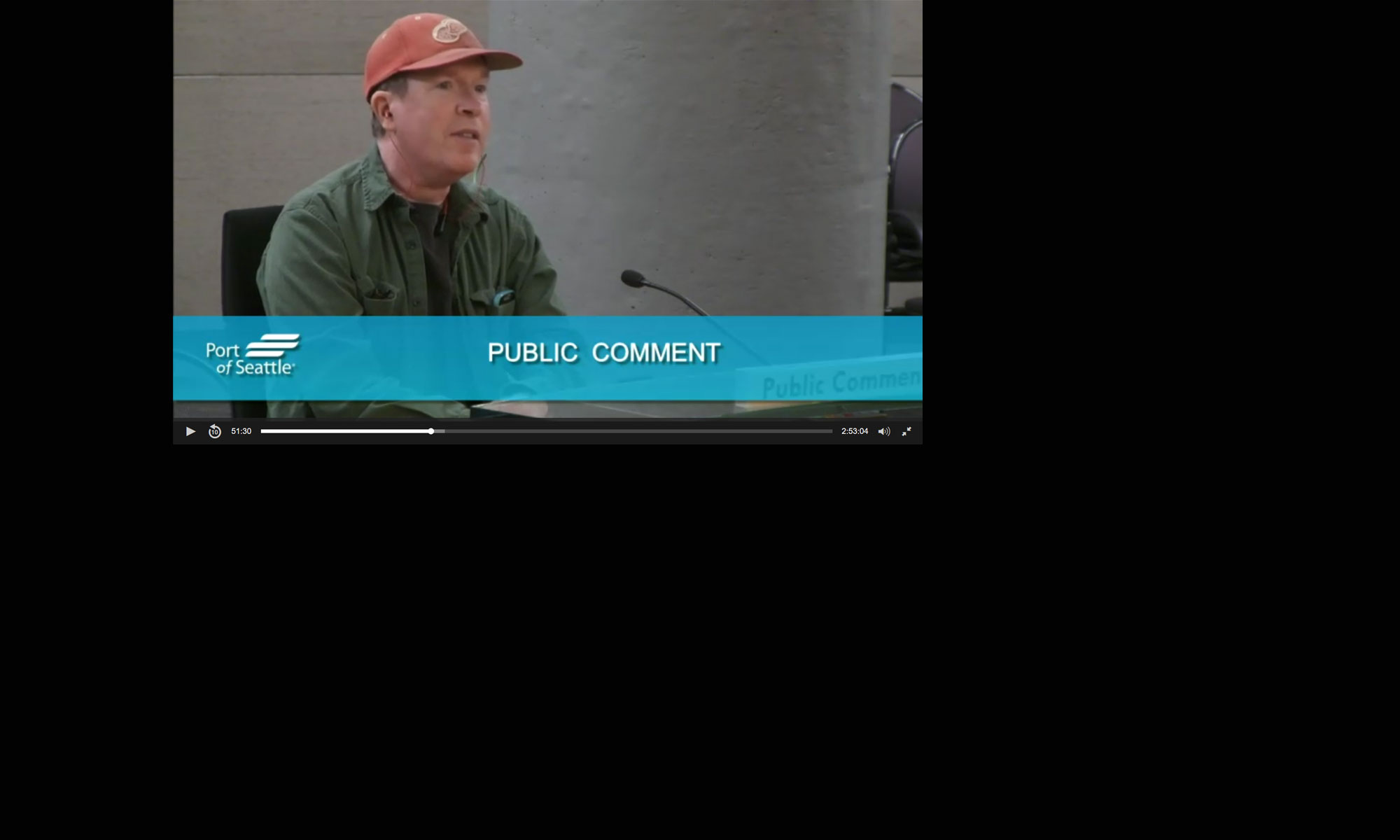
At last week’s City Council Meeting, I felt a lot like this guy (not like an Emperor 😀 ). You have an issue you care about and you can’t understand why other people don’t see what you see. It’s just obvious. 😀
That’s how I feel about our City’s web site. So I made one of the the stupider speeches of my relatively short career–basically along the lines of
“um… er… could… um… er… somebody… um… you know… please… er… uh… well… fix it?’)
Really productive.
I’ve been thinking about this because, at the end of the day, you get elected to convince people to do things, not to be ‘right’. If neither your colleagues (or the public) sees what you see, you’re kind of a failure.
Two other issues…
Beyond the transparency and public engagement issues there are two other problems that I thought were kinda obvious for both my colleagues and the public. They are not and I guess that’s also on me. I’ll summarize here and then, if you give a crap, some details below.
- The current web site is challenging for a significant percentage of our community–many seniors, but also people with disabilities and ESL. That is a not small number of residents (Have I mentioned recently that seniors vote upwards of 90% in some neighborhoods? For a City that prides itself on a commitment to seniors that’s not great.)
- Our digital presence does not properly promote the City’s image and values. It does not look like the web site of a $100 million corporation that wants to attract entrepreneurs and growth.
These are not separate deals. They demonstrate a mindset that goes way beyond a web site. At my old company we had a nickname for it, we called it “Furniture Store Guy”.
Ah, the good ol’ days…
At the dawn of history, when many organizations still had either no or terrible web sites (you know, 2003 😀 ), my company would have a fairly regular argument with skeptical clients about ‘good enough’. How much dough did they really need to put into their digital presence? Here’s a quote from a client who owned a chain of furniture stores (the kind that used to advertise every week in newspapers.)
“Nobody visits the web site, so why are you telling me to spend money on the web site?”
Now I have some problems with this logic, but this guy was no dummy. He had built a successful business. He felt that it was the best use of his resources to put money into things that had been working for decades. However, he didn’t see that the world about to shift from newspapers to smartphones. And he didn’t see how the rest of the world was starting to see his stores as kinda long in the tooth. So he made the decision to have a digital presence that he considered ‘good enough’.
This is democracy…
It took me a while to grasp that the City’s digital presence is really my problem. It’s not only OK with my colleagues and the administration, it’s also just fine with a lot of our businesses and residents.It never dawned on me (really) that so many people don’t see what I see.
I think there are two reasons for this:
- For some, it’s likely because they already have the digital literacy to navigate the site as it is. They don’t recognize how much of a struggle it is for others.
- And for a lot of people and businesses, they just don’t seen the value of the City’s digital presence for them. They don’t see a good digital presence as being the business card, the branding of the City Of Des Moines for the outside world and for our future.
City response…
Early this week I sent an email to the administration with a laundry list of things I see as important fixes. This was totally cringey for many reasons, not the least of which being that I’m sure it comes off as the worst kind of ‘back seat driving’ to staff. But if yer asking people to work on something they don’t see, you gotta be specific.
On Friday, I received a detailed and thoughtful reply from our IT department to each item, which I will over-simplify as “We were already working on it–we had planned to get this done over the summer.”
Which is good and bad. I am glad that some of the major (not all) issues I raised will be addressed. But it’s bad because the City felt like these issues were just not that urgent.
My takeaway:
- Our digital presence is just not a high priority, either to my colleagues or the administration or a good deal of the public. It’s good enough.
- This is exactly the kind of thing that could (and should) be handled in private. But because the relationship between Council and the administration is so verkachte, the only way for me to raise this sort of issue (even to get an update as to what is going on) is to raise it from the dais.
Everything comes down to marketing…
Look, I did a terrible job of explaining why people should care about our City’s digital presence, but this is not about ‘fix the web site’. One of my main goals is to market Des Moines. When people perpetually ask “Why hasn’t Des Moines reached its ‘potential’?”, it hasn’t just been a money issue. It’s also been a marketing issue. A large portion of our residents wanted (and still want) to stay a ‘hidden gem’. For a long time, I was one of those people. We never properly marketed the City. That has to change.
My colleagues often talk about promoting business. The first thing interaction most of the world will have with Des Moines is through some form of digital presence–likely our web site. That’s the first impression, the chance to show a potential resident or business owner or developer who we are and what we value. We can look relatively sophisticated and innovative, or… you know… not.
The best way to look sophisticated and innovative is, you know, to actually do something sophisticated and innovative. 😀 Great marketing tends to be very expensive and time consuming. A decent web site is a cheap way to show the world (and our residents) the kind of community we are and the entrepreneurs we want to attract. At the end of the day, all this jazz about ‘transparency’ and ‘engagement’ and ‘accessibility’ and ‘branding’ is just good marketing. And marketing is what this city has always needed as much as any new building project.
At the risk of sounding passive aggressive, I misunderstood how much selling there is to do here. It’s my fault. At my old company, we turned Furniture Store Guy into a running joke for being stuck in the past. But again, he was not a joke. He rationally chose to stay on a path that had always worked for him. We failed. It was our job to show him that times were changing and that it would be in his best interest to invest in his digital presence.
Because here’s the thing: by the time it became obvious to him that he needed a better digital presence, it was too late. Someone else, more savvy, came into his market and became dominant. He didn’t go out of business. He just never reached his potential.
A specific use case
Since I have so many bitches, and I’ve already traveled deep into cringey back seat driving, I figured, what the hell? I should give you at least one specific example of what ‘better’ looks like. This is a modest City web site that punches above its weight… and it’s right next door: https://normandyparkwa.gov/ 🙂
It’s not just that it’s more accessible. Or that it actually invites feedback from visitors on how better to serve. What catches my eye is that their government had the very sensible notion to hire a for realz marketing agency to develop and project an image and a message. They took their branding and image seriously. It’s not the specific image or branding or message that matters. Or even the fact that they hired an outside company. What matters is that any visitor (whether they are conscious of it or not) immediately sees that the City Of Normandy Park really cares about the image they’re trying to project.
Footnote: Some previous rants I’ve had about the site’s lack of accessibility:
- Apart from any of the other shortcomings of the web site, at least a portion of this discussion trivialises the lack of accessibility for a very large number of our residents.Using any performance metric such as the number of people watching Council meetings or searching for information is not only irrelevant it’s just plain wrong. By such logic, ADA ramps would never have been mandated.
If the site isn’t easy to use for seniors, the disabled and the large number of people who speak other languages, we cannot call ourselves an ‘inclusive’ community.
Inclusion means fair access for everyone, not just the people lucky enough to own an iPhone, have no disabilities, read English fluently–and already possess a level of digital literacy that is apparently taken for granted by people here. Maybe that’s still the majority in Des Moines, but even if it is I could care less.
The web site is a cue as to what the City values, not just in terms of transparency, but in terms of which types of people.
If it cost a million dollars to have a proper web site, I wouldn’t squawk. It doesn’t–it’s actually less than putting in a single ADA ramp.
- An explainer about Section 508 and making the digital world more accessible.
- Shortly after my election, before I was banned any communication with staff, I inquired as to when/if/how the City web site might be updated. I was told that there was no specific plan. However I was also told that in the past, when the City had previously done web site updates, they had requested input from residents and Councilmembers as to how it might be improved–and that such a process would be employed when/if any update would occur. The new site was rolled out with no prior notice and no opportunity for either public or Councilmember input.


